Brand guide · version 1.0 · October 2026
Safety through patience.
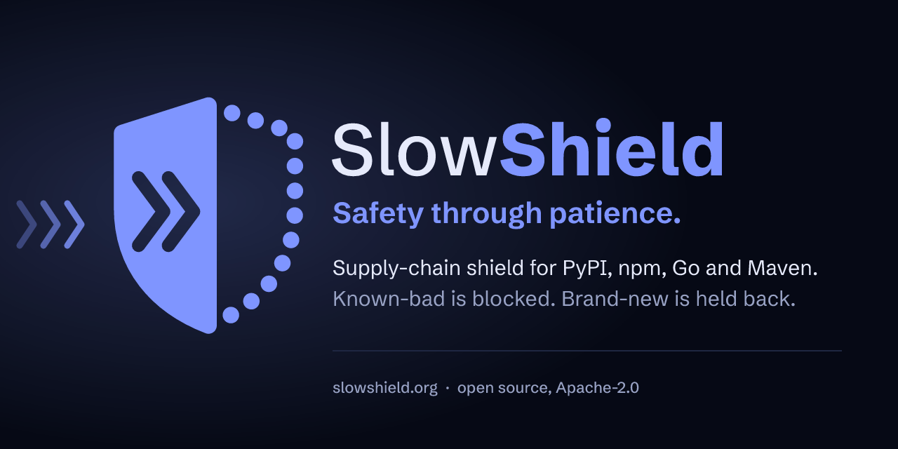
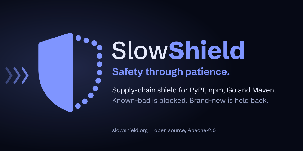
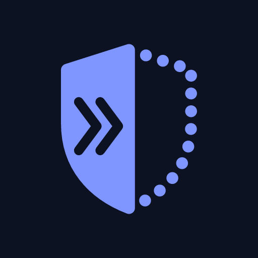
SlowShield's mark is a shield that is solid on the side where things arrive and open on the other. Anything fast, like a release published minutes ago or an attack, hits the solid side and stops there: the chevrons cut into it are what got stopped. Patient, verified packages pass through the open, dotted side.


The mark
Three parts, one idea.
1 · The solid side
Faces where things come from. It is the field at full strength: nothing fast gets through.
2 · The chevrons
Two fast things that arrived and stopped inside the solid side. They always point into the shield.
3 · The dotted side
The open side. The field is there, but it lets patient, verified packages pass.
Construction
- Grid: 64 units. The shield is 44 × 56, crown at (32, 4), point at (32, 60).
- Halves: split exactly on the centre line. The solid half carries an edge stroke of 4.2 units so both halves are equally wide.
- Chevrons: 6.4 × 17.2 units, stroke 3.4, at x = 14.2 and 21.8, centred on y = 31.
- Dots: 4.2 units round, 13 equal steps from crown to point (about 6.3 units). The end dots sit under the solid half's corners, so the first and last visible dots mirror each other.
- Corners: round joins and caps everywhere, no sharp ends.
Clear space and sizes
Keep clear space of a quarter of the mark's height on every side, measured from the shield. Lockups include their clear space in the file.
The master drawing.

Heavier chevrons and dots.

One chevron, and a faint solid line instead of dots.
Below 48 px, use the dedicated drawings (favicon-32.svg, favicon.svg) instead of
scaling the master: dots that small blur into grey. Never go below 16 px.
Colourways


Don't
Lockups
Mark and name, always from the files.
The wordmark is set in Schibsted Grotesk: Slow at weight 500 in ink, Shield at 750 in brand blue. It is outlined in every file, so it looks the same everywhere. Never retype it.

Colour: Night Field
One blue, a calm ground and four colours that mean something.
Brand blue is the only accent. Status colours are for status and nothing else. Every text and status colour clears WCAG AA (4.5:1) on the surface, the page ground and its own badge tint, in both themes.
| Token | Light | Dark |
|---|---|---|
--ss-groundPage background | #f2f4fb | #060915 |
--ss-surfaceCards, tables, top bar | #ffffff | #0d1222 |
--ss-lineBorders and grid lines | #dce1f0 | #1f2742 |
--ss-inkText and headings | #0a0f2419.0:1 on surface | #e6eafb15.6:1 on surface |
--ss-mutedSecondary text, captions, axes | #56607f6.2:1 on surface | #98a2c47.4:1 on surface |
--ss-brandThe mark, primary actions, links, focus | #2a4bff5.9:1 on surface | #7f95ff6.8:1 on surface |
--ss-accentGlows and decoration (never text) | #8ea2ff | #b9c6ff |
--ss-availableServed, healthy | #1074455.8:1 on surface | #4fd48a9.9:1 on surface |
--ss-heldHeld back: too new, fail-open | #6447d66.2:1 on surface | #a99bff7.8:1 on surface |
--ss-blockedKnown malware (HTTP 451) | #c022386.0:1 on surface | #ff6f7e6.9:1 on surface |
--ss-tamperedTampering and integrity failures | #b4208c6.0:1 on surface | #f27bd67.6:1 on surface |
Do
- Use
--ss-brandfor the mark, primary buttons, links and focus rings. - Show status with its colour and a word: “Held”, “Blocked”, never colour alone.
- Use the soft tints (
--ss-*-soft) behind status text in badges. - Let the dark theme be the hero: the field glows against the night.
Don't
- Set text in
--ss-accent; it is for glows only. - Use a status colour for decoration or for the brand.
- Bring back teal, moss or amber as brand colours.
- Hard-code hex values: use the tokens from
tokens.css.
Typography
A sturdy grotesk for the voice, the system font for the work.
Aa
Schibsted Grotesk
Headlines, the wordmark, numbers that matter. Weights 500, 700 and 750. SIL Open Font License 1.1, self-hosted (no requests to font services).
- Display
- New releases wait.
- Heading
- Five simple ideas.
- Title
- Known malware is blocked within the hour.
- Body
- SlowShield holds brand-new releases back for a few days and verifies every byte.
- Code
- pip install requests==2.32.5
The product UI uses only the system fonts: fast, private and allowed by its strict content security policy.
Motif and motion
Fast things stop dead. Slow things drift in.
- Chevrons stand for speed and direction. They always point into the solid side, and fade with distance: the farthest is faintest. Use them sparingly, as list bullets or a stream of three.
- Fast things move fast and stop dead at the solid side (ease-in, about 1.5 s), and the field answers with a ripple.
- Slow things drift through the dotted side at a calm pace (8 to 12 s) and settle.
- Every animation has a still frame that tells the story on its own, shown when someone prefers reduced motion. Nothing important waits for an animation.
- No flashing, no shaking, no countdown panic. SlowShield is calm on purpose.
In the product
Quiet surfaces, clear states.
urllib3Held · 4 daysRelease earlycolouramaBlocked · 451View advisory- Radii: 6 px for badges and inputs, 10 px for cards and buttons, 18 px for large panels (
--ss-radius-s/m/l). - Charts: ecosystems use their logos' primary colours (PyPI
#3775A9, npm#CB3837, Go#00ADD8; Maven uses Java's orange#ED8B00, since its own red is npm's; Cargo uses GitHub's Rust colour#DEA584, since Rust's logo is black); series use the status colours only when they mean that status. - Grafana: the dashboards in
observability/use the same palette.
Voice
Calm, plain, specific.
Name and tagline
- SlowShield: one word, two capitals. Not “Slow Shield”, “Slowshield” or “SS”.
- Tagline: Safety through patience. Sentence case, with the full stop in lockups.
- Say what it does: “known-bad is blocked, brand-new is held back”, not “next-gen supply-chain security platform”.
How we write
- Calm, never alarmist. “Held back: unlocks in 2 days”, not “BLOCKED!”.
- Specific numbers and real examples beat adjectives.
- Honest about limits: the delay is one layer of defence, not magic.
- Short sentences, active voice, no jargon a developer would not use.
Downloads
Everything in one place.
SVG masters are generated by brand/build.py, the raster files by scripts/render_brand.py.
Mark
- mark.svg light backgrounds
- mark-dark.svg dark backgrounds
- mark-mono.svg one colour (currentColor)
- mark-white.svg on brand blue or photos
Lockups

Small sizes and icons
- favicon.svg 16 px drawing, follows the browser theme
- favicon-32.svg 32 px drawing
- favicon.ico 16, 32, 48
- icon-180.png, 192, 512 touch and app icons
- app-icon.svg

Banners, tokens, type
- social-preview.png · svg 1280 × 640
- readme-banner.svg · dark
- tokens.css colours, fonts, radii
- SchibstedGrotesk-VF.ttf · licence